


This last drawing has quite a lot behind it haha, it started out originally as a Valentine's day pic, and as you can tell I totally missed the deadline! The general idea was there since the first sketch, so I decided to polish it off:
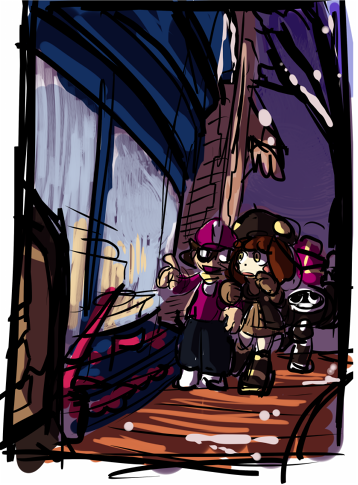
However, I wasn't really feeling that sketch for some reason, so I decided to give it another shot, same idea but drawn in a different angle. I still quite like this one! But something about the original kept grabbing me back, so I decided to not continue with this one. The angle it had was fun, so I'd like to tackle something similar in the future sometime!
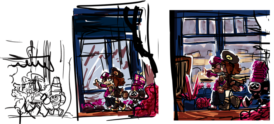
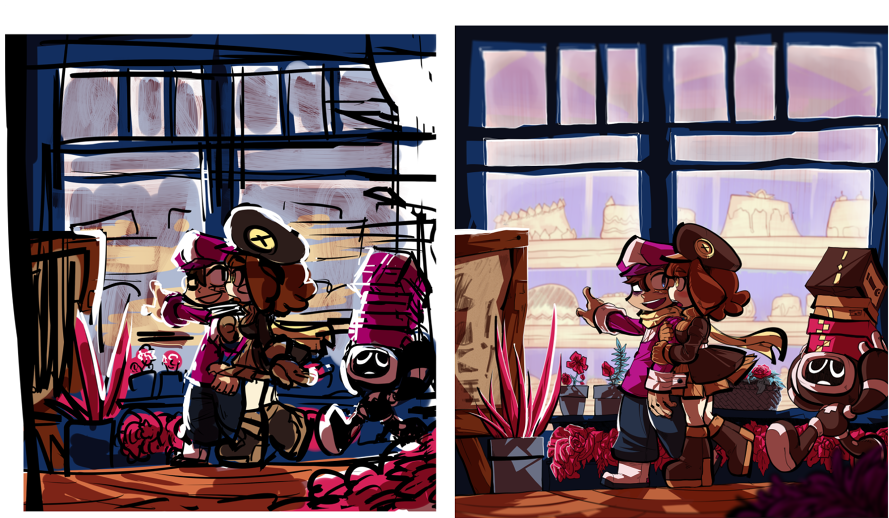
I went back to the original and cleaned it up once again to start lining and coloring, which was a huge mistake on my part retrospectively. By wanting to make it cleaner looking, I feel like a lot of the energy of the original was lost, like with Ram's (the guy) expression, it looked off to me. Even though I ended up practically finishing it, I decided to scrap it, I just really didn't like the outcome at all, I still liked the idea and composition, but something wasn't right about it. After asking for feedback I realized huge things that I never noticed, such as the less contrasting shadows and it looking "flatter" (mostly due to the floor).
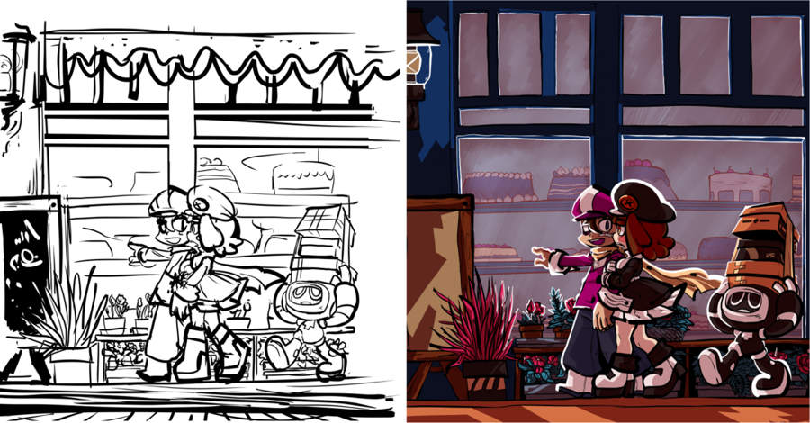
With all that into consideration, I decided to give it one last shot, instead of polishing it off endlessly, I decided to take a looser approach to it and embrace some of that roughness in little things, such as the windows that have some sort of crooked look in comparison to the previous version. In the end I liked this second go at it, and here we are! Much closer to the original look that I wanted.
The only thing I'd change now that I'm looking back on it are Krea's dress colors, the white accents looked nice haha. For some reason I never noticed until now that the previos version had a different pallette on her.
And thats all for this post! Which version do you prefer, the new or old one? If you have any questions or wanna suggest which of past works you'd like to know the process of let me know!
Thanks for reading!
VicariousE
I like the second angle too, gives the characters a little more face space. In fact I wouldn't mind seeing it posted.. doesn't have to be tagged for the Art Portal and/or voting, your fans will still be able to see it in their feed.
mogy64
I thought about posting it alongside the other scrapped version to the Dumping Grounds so anyone who was interested could see them. Not tagging it for the Portal still shows it on my galler y right? Thought the Dumping Grounds would be a better choice since I like only having the most polished stuff up here haha